


Converting clip-path: polygon() to Edge-compatible SVG
I’m trying to create a CSS illustration that works across browsers, including Edge.
Using this answer, I tried to convert the following (working) CSS polygon clip-path to an Edge-compatible, SVG-driven approach. The 1-to-1 method is rendering something, but it’s not the desired result.
What am I misunderstanding here?
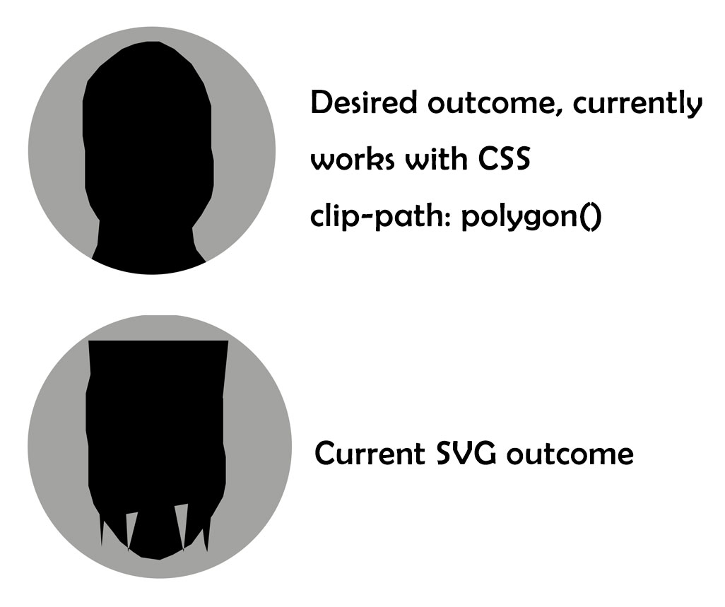
Currently working CSS clip-path: polygon()
.you-headshot { position: relative; max-width: 500px; max-height: 500px; background-color: #a3a3a1; width: 100%; height: 100%; border-radius: 400px; overflow: hidden; } .you-headshot div { position: absolute; height: 100%; width: 100%; } .you-head-outline { background-color: #000; clip-path: polygon(48% 6%, 43% 7%, 38% 9%, 34% 12%, 29% 16%, 24% 22%, 22% 30%, 22% 44%, 23% 50%, 23% 65%, 25% 72%, 28% 77%, 32% 82%, 35% 86%, 40% 90%, 43% 92%, 50% 93%, 55% 91%, 62% 87%, 70% 76%, 74% 69%, 75% 64%, 75% 54%, 74% 49%, 74% 40%, 74% 32%, 71% 23%, 66% 15%, 59% 9%, 53% 6%); } .you-neck-outline { background-color: #000; clip-path: polygon(29% 77%, 28% 88%, 23% 100%, 24% 100%, 76% 100%, 68% 90%, 67% 87%, 65% 71%); }<div class="you-headshot"> <div class="you-neck-outline"> </div> <div class="you-head-outline"> </div> </div>Not working SVG conversion
.you-headshot { position: relative; max-width: 500px; max-height: 500px; background-color: #a3a3a1; width: 100%; height: 100%; border-radius: 400px; overflow: hidden; } .you-headshot div { position: absolute; height: 100%; width: 100%; } .you-head-outline { background-color: #000; clip-path: url(#you-head-outline) } .you-neck-outline { background-color: #000; clip-path: url(#you-neck-outline) }<div class="you-headshot"> <div class="you-head-outline"> </div> <div class="you-neck-outline"> </div> <svg width="0" height="0"> <clipPath id="you-head-outline" clipPathUnits="objectBoundingBox"> <polygon points=".48, .6, .43, .7, .38, .9, .34, .12, .29, .16, .24, .22, .22, .30, .22, .44, .23, .50, .23, .65, .25, .72, .28, .77, .32, .82, .35, .86, .40, .90, .43, .92, .50, .93, .55, .91, .62, .87, .70, .76, .74, .69, .75, .64, .75, .54, .74, .49, .74, .40, .74, .32, .71, .23, .66, .15, .59, .9, .53, .6"/> </clipPath> <clipPath id="you-neck-outline" clipPathUnits="objectBoundingBox"> <polygon points=".29, .77, .28, .88, .23, .100, .24, .100, .76, .100, .68, .90, .67, .87, .65, .71"/> </clipPath> </svg> </div>
You have a few errors:
-
The clipPath elements have the same id as the divs. I’ve changed this by adding
cp-to the clipping paths id -
When you transformed from % to units you have 6% = .6 instead of 6% = .06. Also in your code 100% = .1 instead of 100% = 1
body{height:500px;} .you-headshot { position: relative; max-width: 500px; max-height: 500px; background-color: #a3a3a1; width: 100%; height: 100%; border-radius: 400px; overflow: hidden; } .you-headshot div { position: absolute; height: 100%; width: 100%; } .you-head-outline { background-color: #000; clip-path: url(#cp-you-head-outline) } .you-neck-outline { background-color: #000; clip-path: url(#cp-you-neck-outline) }<svg width="0" height="0"> <clipPath id="cp-you-head-outline" clipPathUnits="objectBoundingBox"> <polygon points=".48, .06, .43, .07, .38, .09, .34, .12, .29, .16, .24, .22, .22, .30, .22, .44, .23, .50, .23, .65, .25, .72, .28, .77, .32, .82, .35, .86, .40, .90, .43, .92, .50, .93, .55, .91, .62, .87, .70, .76, .74, .69, .75, .64, .75, .54, .74, .49, .74, .40, .74, .32, .71, .23, .66, .15, .59, .09, .53, .06"/> </clipPath> <clipPath id="cp-you-neck-outline" clipPathUnits="objectBoundingBox"> <polygon points=".29, .77, .28, .88, .23, 1, .24, 1, .76, 1, .68, .90, .67, .87, .65, .71"/> </clipPath> <polygon points=".29, .77, .28, .88, .23, 1, .24, 1, .76, 1, .68, .90, .67, .87, .65, .71"/> </svg> <div class="you-headshot"> <div class="you-neck-outline"> </div> <div class="you-head-outline"> </div> </div>


